"After sharing this on Reddit and seeing the amazing response, I wanted to open up my
.cpsfile and show the 'messy' process behind the illustration. I'm not an artist and I have no formal training, so this post is just to show you how I went about drawing this image from scratch."
1. The inspiration
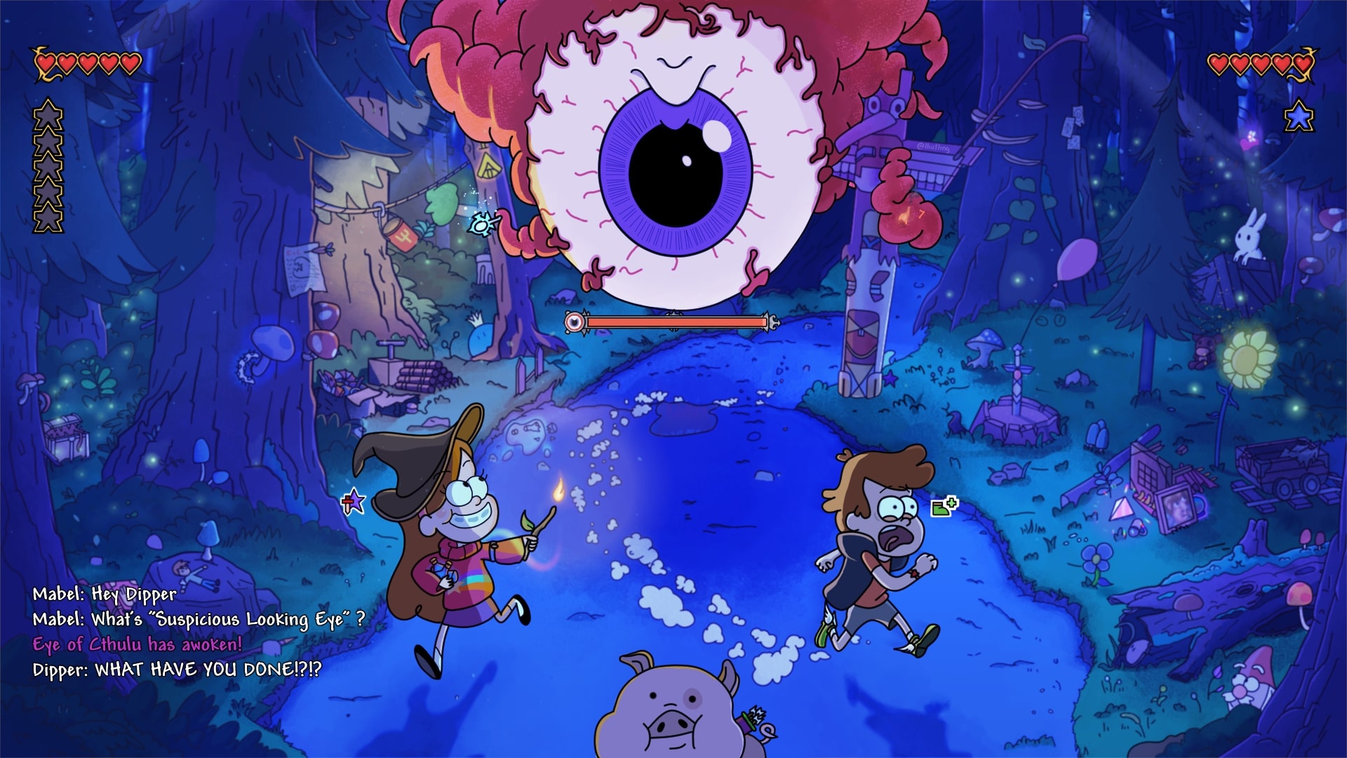
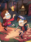
Gravity Falls and Terraria are my all-time favorite cartoon and game. To me, they're a perfect match - both are built on a foundation of mystery and "weirdness."
This project actually started back in 2022 during a really difficult time in my life; creating this was my way of coping. Even though I have zero background in art, I spent a month teaching myself the basics of digital drawing and obsessively analyzing the Gravity Falls art style. In this post, I'm going to show you how I "faked" my way from some truly ugly sketches to a complete illustration
2 The "Copy-to-Learn" Phase
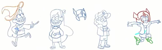
Since I have no background as an artist, I started by copying some of official poses just to learn how the characters are built. The main art style I used is from Gravity Falls; Terraria was an additional theme I wanted to layer in. I wasn't trying to be original yet; I just needed to understand the "language" of the style.
 By analyzing the show, I learned that Gravity Falls uses a distinctive, cartoony style that mixes cute, simplified characters with simple, rounded shapes. I practiced using thick outlines and vibrant colors to make the characters stand out clearly from their environments.
I also focused on their exaggerated expressions, like wide mouths and flexible eyebrows, to capture the humor and emotion of the scene. Once I felt I had the hang of these rules, I realized the show's moody lighting and highly detailed, textured backgrounds were a perfect match for the darker, adventurous tone of Terraria.
By analyzing the show, I learned that Gravity Falls uses a distinctive, cartoony style that mixes cute, simplified characters with simple, rounded shapes. I practiced using thick outlines and vibrant colors to make the characters stand out clearly from their environments.
I also focused on their exaggerated expressions, like wide mouths and flexible eyebrows, to capture the humor and emotion of the scene. Once I felt I had the hang of these rules, I realized the show's moody lighting and highly detailed, textured backgrounds were a perfect match for the darker, adventurous tone of Terraria.
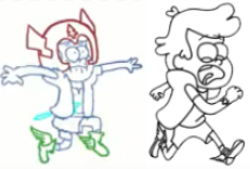
You might notice in the early sketches that Dipper's first pose looks a bit different. Over time, it started looking weird to me, so I ended up scrapping that first version entirely and changing it to the final panicked run you see now.
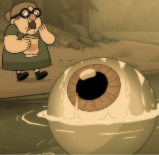
Finally, I had to translate the Eye of Cthulhu into this new style. I pulled references from the original game, its crossover with Don't Starve Together, and an actual eyeball seen in Gravity Falls.
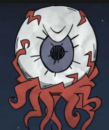
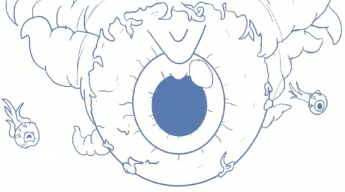
I studied how the show handles monsters and applied those "rules" - like thick, tapering outlines and fleshy veins - to make the Eye feel threatening but still "cartoony."
3. The Doodle Trap (The Background)
I originally planned to draw the characters with just a simple background to ground them, but I ended up lost in a forest - literally. I started sketching the trees,
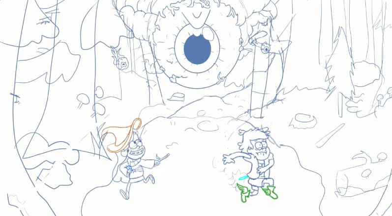 and because I love doodling, I couldn't stop myself from filling every empty space with references.
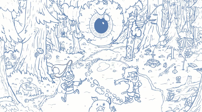
What started as a basic environment quickly spiraled into a massive workload because I wanted to pack in as many secrets and action details as possible. I ended up hiding a ton of items and "environmental storytelling" for fans to find:
- Terraria Loot: I tucked away an Enchanted Sword, a Sun Flower, a Crate, and even high-tier items like the Last Prism and a Guide Voodoo Doll.
- Gravity Falls Loot: I added Stan's walking stick, a hidden Gnome, and a 4th Journal- indicating that this crossover is a whole new mystery unique to this world (not on the previous sketch, only visible on the final).
- Life in the Woods: I even added a small Terraria bunny watching the chaos unfold from the sidelines.
- Evidence of Chaos: I drew trees fallen down and snapped, showing the path of destruction where the Eye of Cthulhu just passed by.
- The Blast Effect: I added wind from the boss's shriek, which are powerful enough to blast away nearby objects like the fishing pole and the balloon.
- The Collision: I included evidence that Dipper accidentally crashed into Mabel in his panic, causing her to drop her Mana Potion which are now scattered on the ground.
By the time I finished the full sketch, I realized I had accidentally created a highly detailed and textured composition. Since I didn't have a plan, I just kept adding things until I literally couldn't fit anything else in. It went from a "simple background" to a complex scene that was honestly a bit intimidating to color.
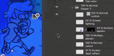
4.The Coloring Method
Because I had so many details to mange, I needed a structured way to handle the color without getting overwhelmed. My "fake it till you make it" strategy relied on a very specific layering system for almost every object in the scene.
The 4-Layer Rule to keep everything organized, each object (like the characters or even a table) consists of at least four distinct layers:
- The Lineart: Thick, clean outlines to maintain that Gravity Falls aestheic. I used bold black strokes for characters and thinner, dimmed strokes for background objects to separate the characters from the scene.
- Flat/Raw Colors: The "base" colors of the object. I used an uniform brush for consistency.
- Lighting & Shadows: A dedicated layer to define the shapes and depth. I used spray and non-uniform brushes to create an organic, gritty texture for the mysterious forest.
- Adjustment Layers: At least one layer used for fine-tuning the final look. Many to be mentioned but most of the layers are screen and multiply.
Painting with Light is the most important of my process. I actually started by coloring everything in "Day Mode" with raw, natural colors. I didn't try to paint the mystery immediately; I just focused on getting the base colors right first.
Later on, I applied many adjustment layers - moving from individual objects to much larger - to "dim the lights" and create the final atmospheric mood. THis allowed me to control exactly how much the magical Terraria items glowed against the dark, cinematic woods of Gravity Falls.
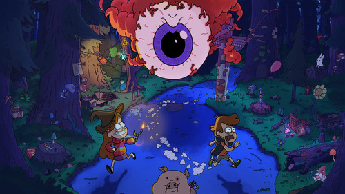
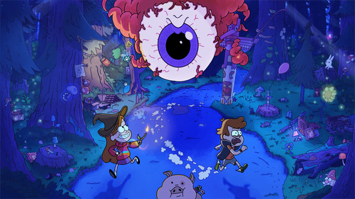
The Final Touch
Once the core coloring was done, I applied a series of "global" effects to blend the characters into the world and give the image a cinematic finish:
- The "Divide" Trick: I accidentally discovered the 70% Gold Divide layer while experimenting with the background. It worked by "subtracting" the dark blues of the forest to create vibrant, eerie highlights that feel like glowing magic.
- Depth of Field: I applied a light blur to the background based on the actual distance of the trees and objects. This mimics a real camera lens, making the forest feel massive and deep while keeping the focus on the three main characters.
- Dynamic Ambient Lighting: I added ambient light glows to create movement and enrgy throughout the illustration.
- Strategic Contrast: I boosted the contrast in specific areas to add more interesting, punchy feel to the scene and create a sense of atmosphere and volume, helping to distinct the sharp characters from the textured environment.
Here are the before and after images when adding the final touch:
5. Conclusion
This project was a journey from simply copying characters to building a living, breathing crossover world. By combining the "Doodle Canvas" of references with a structured Coloring Method, I turned a black canvas into a snapshot of total chaos.
Seeing the process sped up really highlights how much the small details matter. Even as a non-professional, I learned that with enough layers and a love for the source material, you can create something that looks like it belongs on the screen.
Thank you for reading.
Next steps? I have an idea for making this a moving illustration with subtle movements but who knows!
Join the discussion!